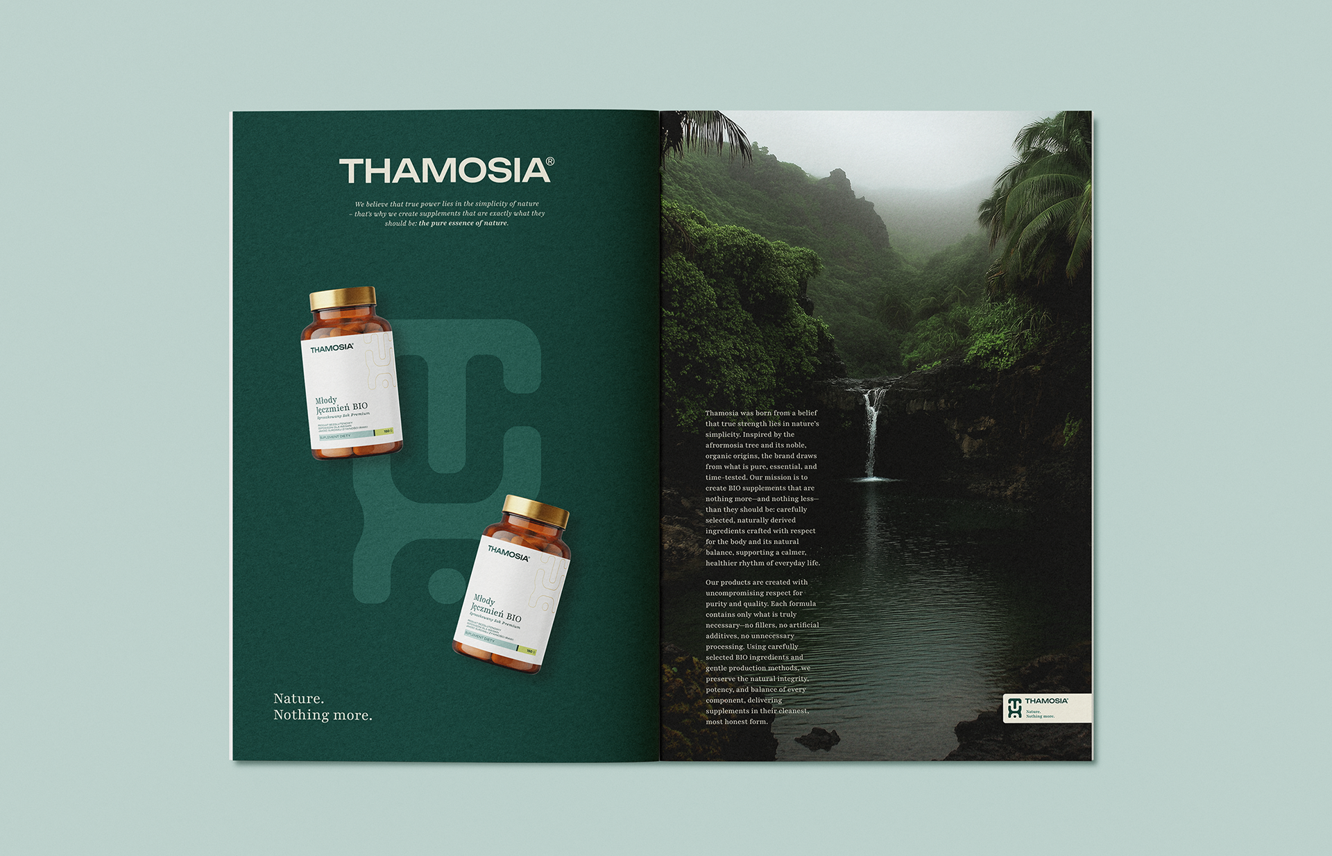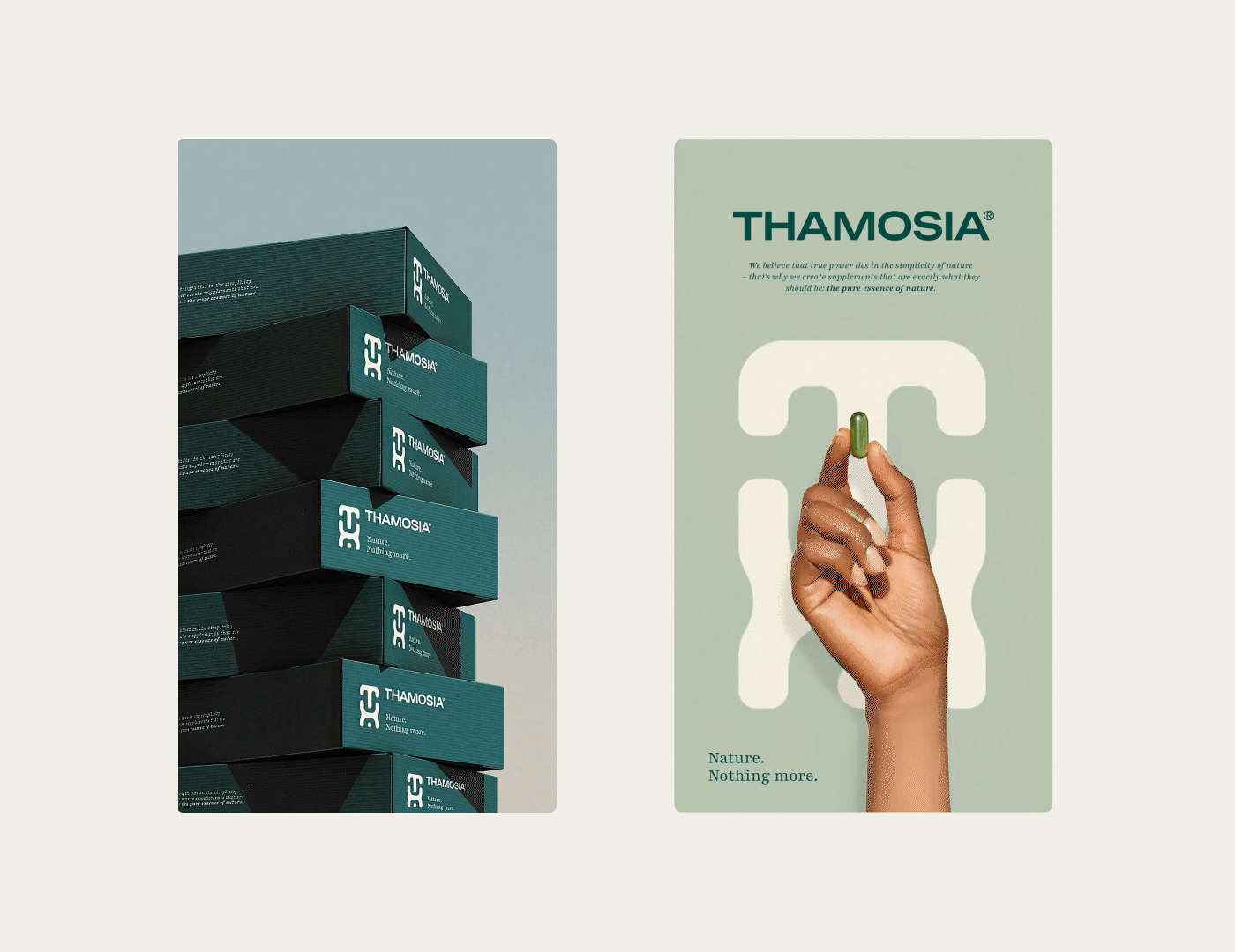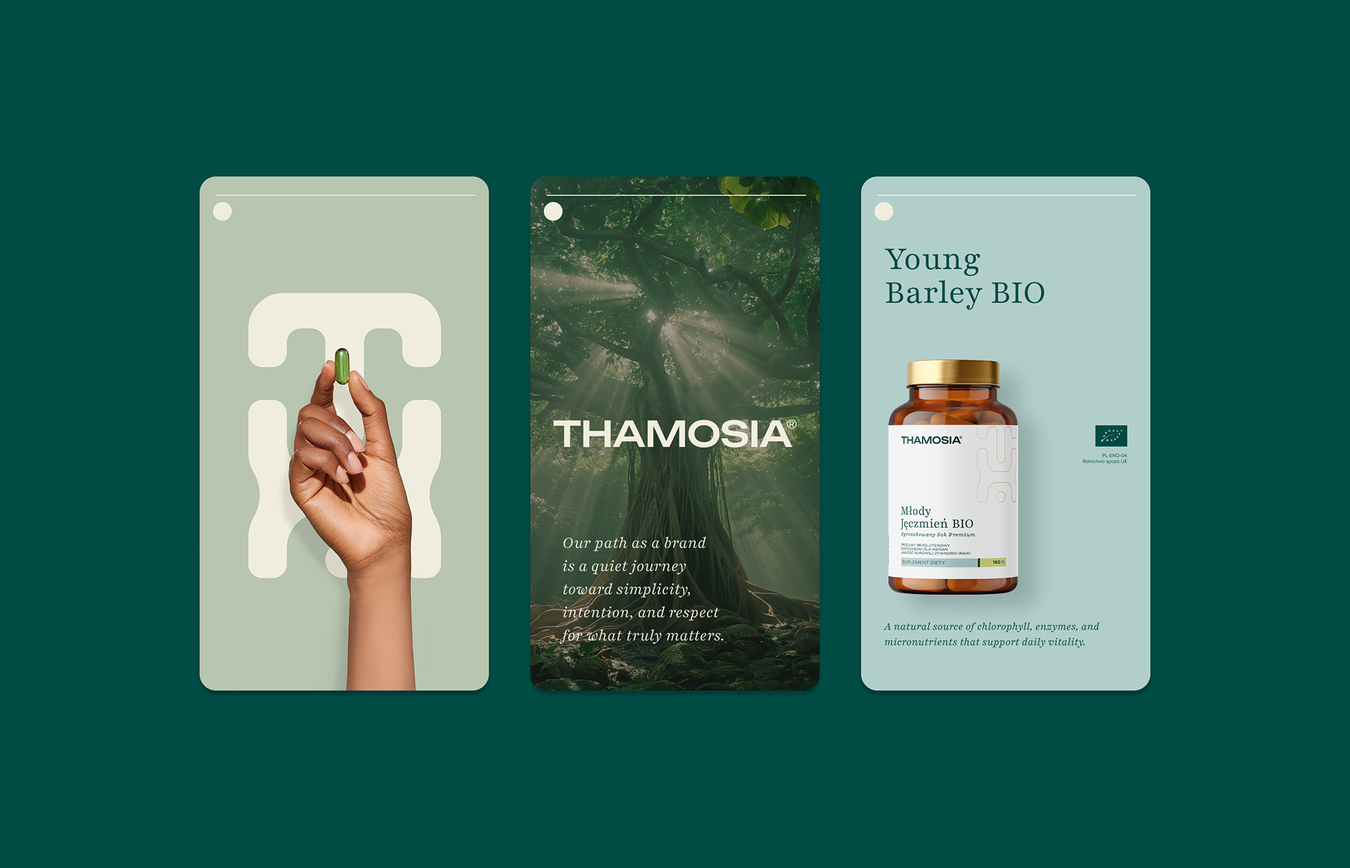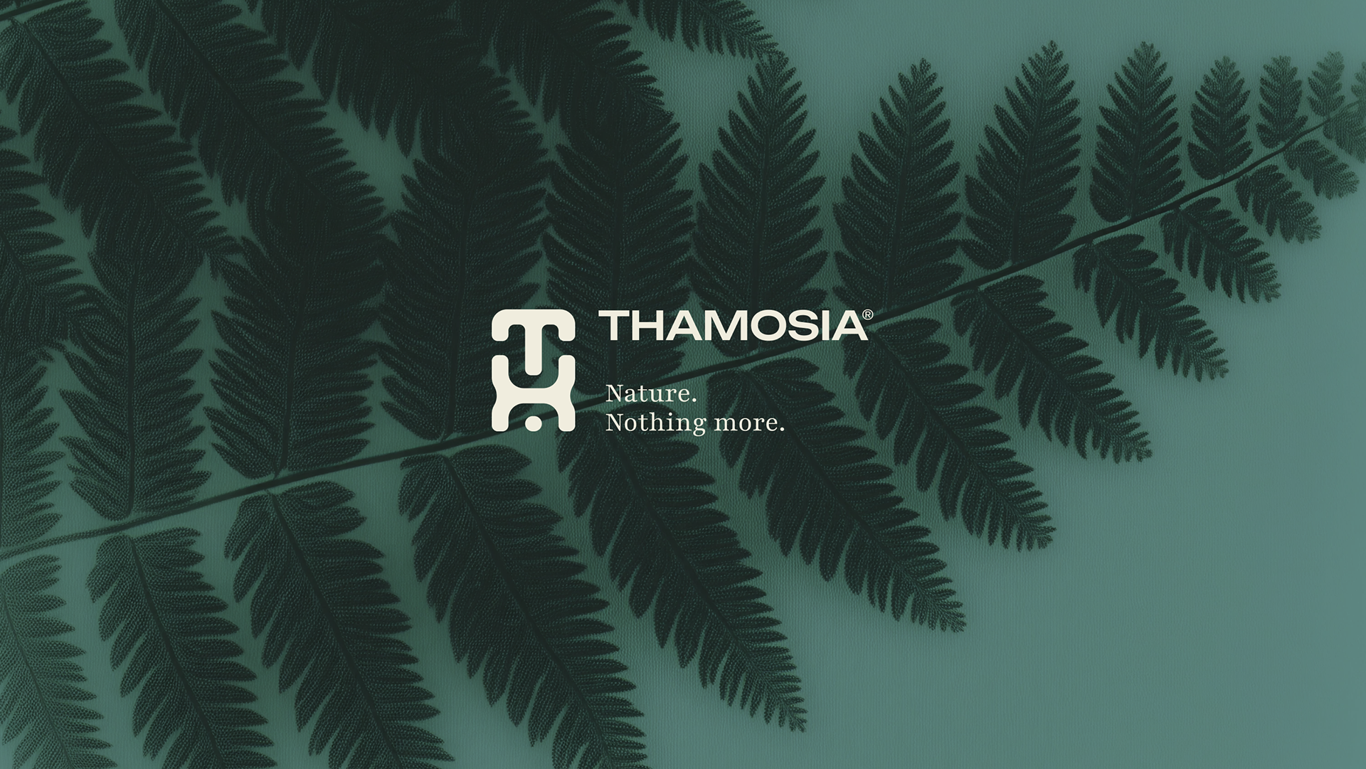
Thamosia is a premium BIO supplement brand rooted in the philosophy of simplicity and purity. Inspired by nature and crafted with minimalist aesthetics, the brand combines carefully selected, clean ingredients with a calm, refined visual identity. The project focused on creating a timeless logo, label designs, and a consistent system that reflects balance, trust, and respect for the natural essence of each product.
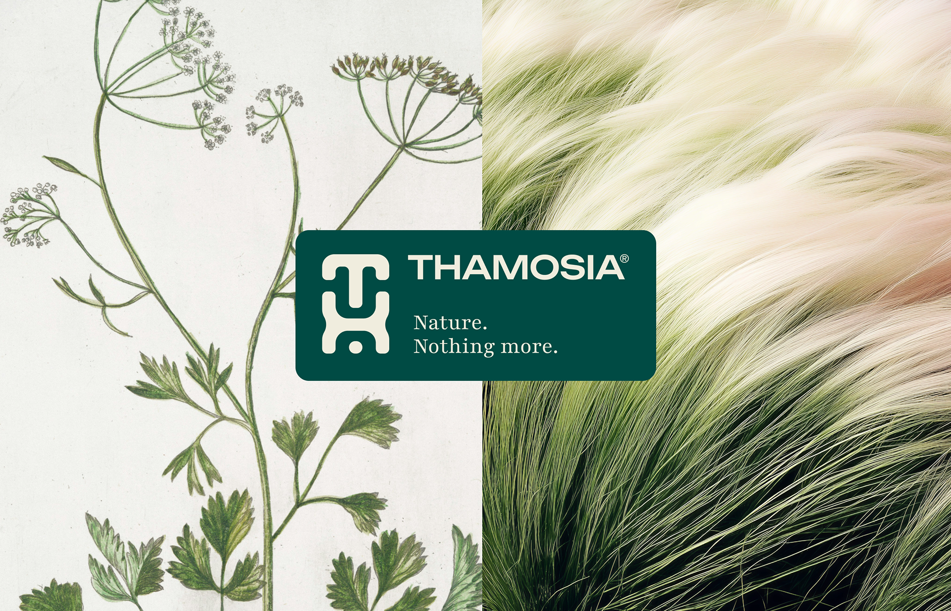
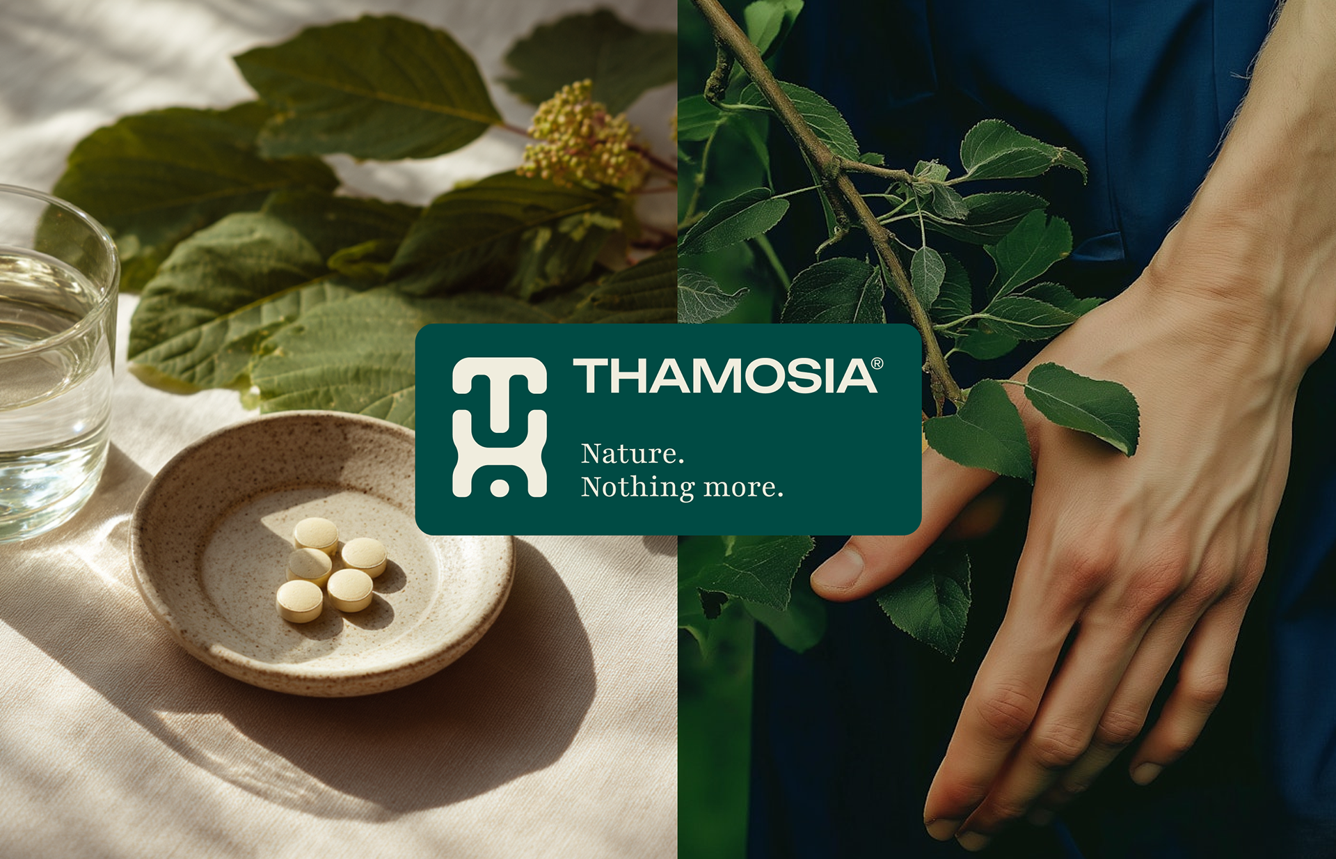
The name Thamosia draws its origin from the afrormosia tree - valued for its strength, durability, and noble character, and from the word ambrosia - symbolizing something pure, precious, and life-giving, together reflecting the brand’s connection to nature and essential vitality.
The name Thamosia draws its origin from the afrormosia tree - valued for its strength, durability, and noble character, and from the word ambrosia - symbolizing something pure, precious, and life-giving, together reflecting the brand’s connection to nature and essential vitality.